Basic dialog
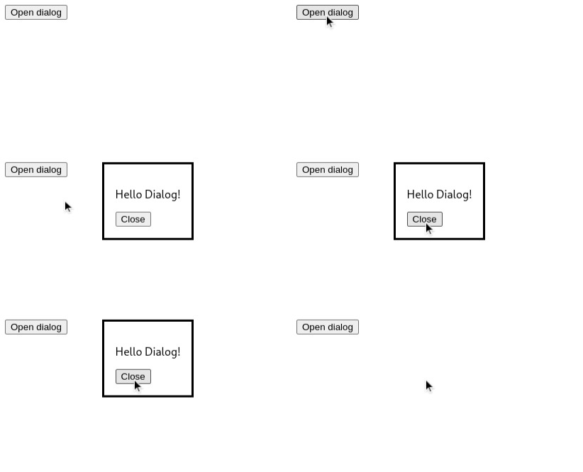
Let's create a simple dialog and call show method to open the dialog.
import {useRef} from 'react'

export default function App() {
  const dialogRef = useRef(null)

  function openDialog() {
    dialogRef.current.show()
  }

  return (
    <div>
      <dialog ref={dialogRef}>
        <p>Hello Dialog!</p>
        <form method='dialog'>
          <button>Close</button>
        </form>
      </dialog>

      <button onClick={openDialog}>Open dialog</button>
    </div>
  )
}

As it is simply a dialog, it does not have any backdrop and it is not centered. To make it a modal,
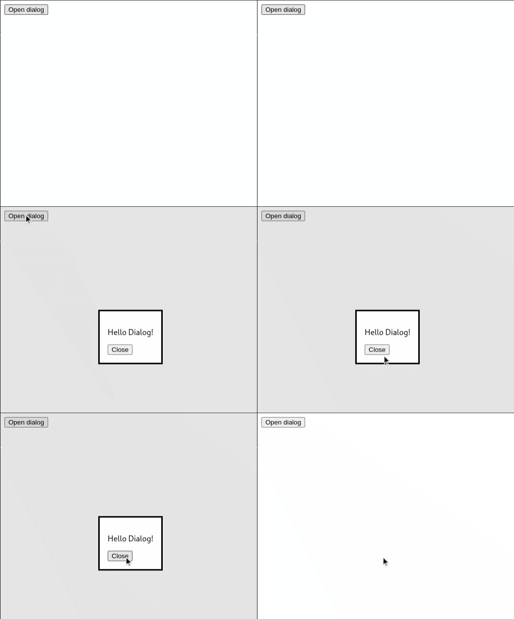
we just need to use the showModal method.
Change the openDialog function and call showModal.
function openDialog() {
  dialogRef.current.showModal()
}

Now it is centered and has a light dark backdrop.
Styling dialog element
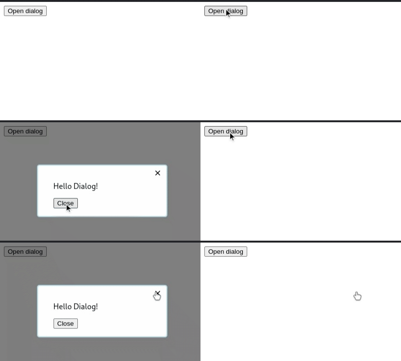
Let's add some styles and opening animation to make the modal look nice.
dialog {
  width: 200px;
  border: 2px solid lightblue;
  border-radius: 5px;
  padding: 1rem 2rem;
  text-align: initial;
}

dialog[open] {
  animation: show-dialog 0.2s ease normal;
}

dialog::backdrop {
  background: rgba(0, 0, 0, 0.5);
}

@keyframes show-dialog {
  from {
    transform: scale(0.9);
    opacity: 0;
  }
  to {
    transform: scale(1);
    opacity: 1;
  }
}

Closing modal
We can use the close method to close the modal. Also note that, because the dialog has a
form element which has method attribute set to dialog. So, clicking any button inside the form will
also close the modal.
Let’s add a close icon inside the dialog.
import React, { useRef, useEffect } from 'react';
function closeCallback() {
console.log('Dialog closed');
}
export default function App() {
const dialogRef = useRef(null);
function openDialog() {
dialogRef.current.showModal();
}
function closeModal() {
dialogRef.current.close();
}
useEffect(() => {
const currentRef = dialogRef.current;
currentRef.addEventListener('close', closeCallback);
return () => currentRef.removeEventListener('close', closeCallback);
}, []);
return (
<div>
<dialog ref={dialogRef}>
<p>Hello Dialog!</p>
<form method="dialog">
<button>Close</button>
</form>
<p className="close-icon" onClick={closeModal}>
⨯
</p>
</dialog>
<button onClick={openDialog}>Open dialog</button>
</div>
);
}
.close-icon {
  position: absolute;
  inset: -15px 10px auto auto;
  font-size: large;
  cursor: pointer;
}

We have also added a close event handler, this can be used to notify any other component that the dialog has closed.
That's all.
You can learn more about dialog element and how to support older browsers at MDN.
